Blog redesign
Sep 8 2013 · Blog
I’ve not posted anything in a while partly due to time constrains but mostly because I’ve been working on redesigning this blog and wanted my focus to be 100% on the redesign before publishing anything new. In addition to the redesign I also wanted to put this blog on it’s own domain and move away from aautar.digital-radiation.com/blog (when this blog was setup the digital radiation team was more than myself, hence the aautar subdomain, and I wanted other, non-Wordpress pages, to live in the root, hence the /blog folder). I snagged the semisignal.com domain a while back and thought it was a great choice for the blog and positioned it away from old or non-relevant content on digital radiation; this blog (and content linked to from this blog) have been the only things relevant on that site for quite a while.
With regards to the redesign, I had a few key goals in mind as I was working, which I’ll run through below.

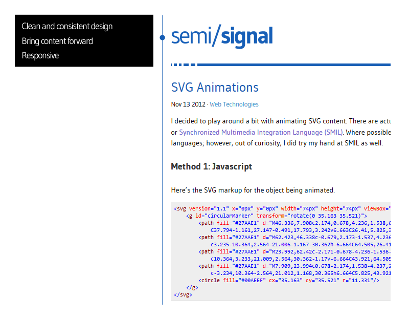
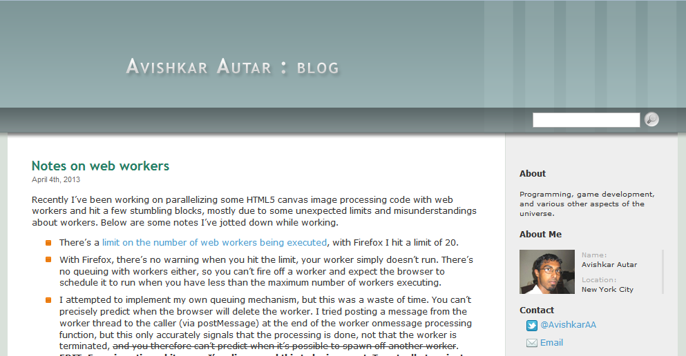
- Clean and consistent design: One of the big problems with the old blog was that it was hacked together from the default WordPress template at a time when I knew very little CSS. There was a lot of bad things both in the code I wrote and in the base code I was working from. I kept making minor improvements over time but there were still a lot of things that didn’t look good (unstyled input buttons, tags, etc.) and things that only looked good if additional inline styles were applied. There were also a number of inconsistencies in regards to link styling, tag styling, search input location, etc… a lot being due to different rendering code for single posts vs multiple posts in the archives and search. This redesign attempts to address these issues, while providing a cleaner, fresher look to the blog overall.
- Bring content forward: At one of my first jobs, my boss mentioned that one of the design goals of our project was to “bring content forward”, pushing back superficial elements that took up real estate but had no real functional purpose. This has stuck with me since. With this redesign, I ditched the massive header, ditched the blurb and photo of myself, and increased the space given to posts.
- Responsive: Admittedly this was not a goal when I started this redesign, but more and more I wanted something that would at least scale comfortably on a tablet and allow navigation via touch. I probably did responsive design wrong here (it’s not mobile first, styles are hacked in here and there to accommodate for different sections and breakpoints), but the new design was simple enough that I really only dealt with scaling elements and not with stacking them. For the lowest resolution breakpoints (for phones), I simply dropped the sidebar, betting that search was a better means of navigation on a phone, where a user’s intent is more directed towards a specific need, and they likely aren’t looking to browse the site.

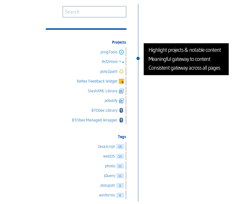
- Highlight projects & notable content: As with the old design, I wanted to keep a section in the sidebar to highlight my projects. Going forward I may add another section or expand this section to include notable posts as there are a handful of posts which are popular, but visitors really don’t have a way to find those easily.
- Meaningful gateway to content: With the old design, you could browse through posts by going to a month in the Archives or selecting a specific Category. Neither of these really made sense. Category (in the way I use it) is generally way too broad to browse over and digging into the Archives gives you, essentially, a random set of posts given that the only context binding the posts is the date they were published and my posts are not time sensitive in nature.
- Consistent gateway across all pages: With the old design there were 2 ways a post could be displayed: narrowcolumn where the post with listed with others and the sidebar content was displayed, and widecolumn where only a single post was displayed but the sidebar was empty (with a fixed width layout, going wider has always been preferable for me but I hated the layout of an article changing when you clicked to view a single post, so I had reduced the width on the widecolumn display as well). Search was also not available in the widecolumn display (I have no excuse for that). With the new design the sidebar (at non-mobile resolutions) and search field are consistent and visible across all pages.

The old design served me well for a long time and, looking back, it’s surprising how well it held up, given that so much was hastily hacked together. That said, I’m excited to move forward with this new design and begin focusing on content again.


