Posts Tagged ‘SVG’

SVG filters and invisible paths

The setup

Let’s just right into it and look at a few paths:

  • We have the arrow thingy (M100 100 L330 453 L349 349 L527 349 L100 100)
  • The horizontal line (M50 50 L200 50)
  • The vertical line (M125 10 L125 50)

There’s some CSS to style the paths:

path { fill: none; stroke-width: 3px; stroke: url('#gradient'); }

There’s also some code for the linear gradient, but that’s not relevant here.

A blur filter

A simple SVG gaussian blur filter can be done as follows:

<defs> <filter id="blur"> <feGaussianBlur in="SourceGraphic" stdDeviation="2" /> </filter> </defs>

Applying that filter to the paths (via filter:url(#blur) CSS rule), we get the following:

So, that kinda works, but the horizontal and vertical paths are now invisible!

A problem with filterUnits

The issue surfaces due to the value of the filterUnits attribute on the filter element is set to objectBoundingBox (which is also the default when a value is not specified). From the SVG spec:

Keyword objectBoundingBox should not be used when the geometry of the applicable element has no width or no height, such as the case of a horizontal or vertical line, even when the line has actual thickness when viewed due to having a non-zero stroke width since stroke width is ignored for bounding box calculations. When the geometry of the applicable element has no width or height and objectBoundingBox is specified, then the given effect (e.g., a gradient or a filter) will be ignored.

objectBoundingBox simply means that the x, y, width, height attributes on the filter are relative to the bounding box of the element referencing the filter, so it’s confusing why this should be an issue at all. In any case, it’s of course problematic for paths which have no width and height.

The solution

The solution is simply to change the filterUnits attribute to userSpaceOnUse. If you make use of the x, y, width, height attributes on the element, they will also need to be updated, as these attributes will now represent the coordinate system in which the element referencing the filter is (as opposed to the bounding box of that element).

<defs> <filter id="blur" filterUnits="userSpaceOnUse"> <feGaussianBlur in="SourceGraphic" stdDeviation="2" /> </filter> </defs>

A simple fix but this is an annoying issue and I see no clear reason as to why filterUnits="objectBoundingBox" should be problematic for elements without a defined width and height.

Rendering HTML to images with SVG foreignObject

Motivation

For applications that allow users to create visual content, being able to generate images of their work can be important in a number of scenarios: preview/opengraph images, allowing users to display content elsewhere, etc. This popped up as a need for ScratchGraph and led me to research a few possible solutions. Using the SVG <foreignObject> element was one of the more interesting solutions I came across, as all rendering and image creation is done client-side.

<foreignObject> to Image

<foreignObject> is a somewhat strange element. Essentially, it allows you to load and render arbitrary HTML content within SVG. This in and of itself isn’t helpful for generating an image, but we can take advantage of two other aspects of modern browsers to make this a reality:

  • SVG markup can be dynamically loaded into an Image by transforming the markup into a data URL
  • Data URL length limits are no longer a concern. We no longer have the kilobyte-scale limits we were dealing with a few years ago

Sketching it out, the process looks something like this (contentHtml is a string with the HTML content we want to render):

The code for this is pretty straightforward:

// build SVG string
const svg = `
<svg xmlns='http://www.w3.org/2000/svg' width='
${width}' height='${height}'>
<foreignObject x='0' y='0' width='
${width}' height='${height}'>
${contentHtml}
</foreignObject>
</svg>`
;

// convert SVG to data-uri
const dataUri = `data:image/svg+xml;base64,${window.btoa(svg)}`;

Here I’m assuming contentHtml is valid and can be trusted. If that’s not the case, you’ll likely need some pre-processing steps before sticking it into a string like this.

The code above works, to a degree; there’s a few key limitations to be aware of:

  • Cross-origin images served without CORS headers won’t load within <foreignObject>
  • Styles declared via stylesheets do not pass through to the contents of <foreignObject>
  • External resources (images, fonts, etc.) won’t be in the generated Image, as the browser doesn’t wait for these resources to be loaded before rendering out the image

The cross-origin issue may be annoying and unexpected (as the browser does load these images), but it’s a valid security measure and CORS provides the mechanism around it.

Handling stylesheets and external resources are more important concerns, and addressing them allows for a much more robust process.

Handling stylesheets

This isn’t anything too fancy, here are the steps involved:

  • Copy all the style rules, from all the stylesheets, in the parent document
  • Wrap all those rules in a <style> tag
  • Prepend that string to the contentHtml string

The code for this precursor step looks something like this:

const styleSheets = document.styleSheets;
let cssStyles = "";
let urlsFoundInCss = [];

for (let i=0; i<styleSheets.length; i++) {
for(let j=0; j<styleSheets[i].cssRules.length; j++) {
const cssRuleStr = styleSheets[i].cssRules[j].cssText;
cssStyles += cssRuleStr;
}
}

const styleElem = document.createElement("style");
styleElem.innerHTML = cssStyles;
const styleElemString = new XMLSerializer().serializeToString(styleElem);

...

contentHtml = styleElemString + contentHtml;

...

Handling external resources

My solution here is somewhat curd, but it’s functional.

  • Find url values in the CSS code or src attribute values in the HTML code
  • Make XHR requests to get these resources
  • Encode the resources as Base64 and construct data URLs
  • Replace the original URLs (in the CSS url or HTML src) with the new base64 data URLs

The following shows how this is done for the HTML markup (the process is only slightly different for CSS).

const escapeRegExp = function(string) {
return string.replace(/[.*+?^${}()|[\]\\]/g, '\\$&'); // $& means the whole matched string
};

let urlsFoundInHtml = getImageUrlsFromFromHtml(contentHtml);
const fetchedResources = await getMultipleResourcesAsBase64(urlsFoundInHtml);
for(let i=0; i<fetchedResources.length; i++) {
const r = fetchedResources[i];
contentHtml = contentHtml.replace(
new RegExp(escapeRegExp(r.resourceUrl),"g"), r.resourceBase64);
}

The getImageUrlsFromFromHtml() and parseValue() methods that extract the value of src attributes from elements:

/**
*
*
@param {String} str
*
@param {Number} startIndex
*
@param {String} prefixToken
*
@param {String[]} suffixTokens
*
*
@returns {String|null}
*/
const parseValue = function(str, startIndex, prefixToken, suffixTokens) {
const idx = str.indexOf(prefixToken, startIndex);
if(idx === -1) {
return null;
}

let val = '';
for(let i=idx+prefixToken.length; i<str.length; i++) {
if(suffixTokens.indexOf(str[i]) !== -1) {
break;
}

val += str[i];
}

return {
"foundAtIndex": idx,
"value": val
}
};

/**
*
*
@param {String} str
*
@returns {String}
*/
const removeQuotes = function(str) {
return str.replace(/["']/g, "");
};

/**
*
*
@param {String} html
*
@returns {String[]}
*/
const getImageUrlsFromFromHtml = function(html) {
const urlsFound = [];
let searchStartIndex = 0;

while(true) {
const url = parseValue(html, searchStartIndex, 'src=', [' ', '>', '\t']);
if(url === null) {
break;
}

searchStartIndex = url.foundAtIndex + url.value.length;
urlsFound.push(removeQuotes(url.value));
}

return urlsFound;
};

The getMultipleResourcesAsBase64() and getResourceAsBase64() methods responsible for fetching resources:

/**
*
*
@param {String} url
*
@returns {Promise}
*/
const getResourceAsBase64 = function(url) {
return new Promise(function(resolve, reject) {
const xhr = new XMLHttpRequest();
xhr.open(
"GET", url);
xhr.responseType =
'blob';

xhr.onreadystatechange =
async function() {
if(xhr.readyState === 4 && xhr.status === 200) {
const resBase64 = await binaryStringToBase64(xhr.response);
resolve(
{
"resourceUrl": url,
"resourceBase64": resBase64
}
);
}
};

xhr.send(
null);
});
};

/**
*
*
@param {String[]} urls
*
@returns {Promise}
*/
const getMultipleResourcesAsBase64 = function(urls) {
const promises = [];
for(let i=0; i<urls.length; i++) {
promises.push( getResourceAsBase64(urls[i]) );
}
return Promise.all(promises);
};

More code

The code for this experiment is up on Github. Most functionality is encapsulated with the ForeignHtmlRenderer method, which contains the code shown in this post.

Other Approaches

  • Similar (same?) approach with dom-to-image
    This library also uses the <foreignObject> element and an approach similar to what I described in this post. I played around with it briefly and remember running to a few issues, but I didn’t keep the test code around and don’t remember what the errors were.
  • Server-side/headless rendering with puppeteer
    This seems to be the defacto solution and, honestly, it’s a pretty good solution. It’s not too difficult to get it up and running as a service, though there will be an infrastructure cost. Also, I’d be willing to bet this is what services like URL2PNG use on their backend.
  • Client-side rendering with html2canvas
    This is a really cool project that will actually parse the DOM tree + CSS and render the page (it’s a rendering engine done in client-side javascript). Unfortunately, only a subset of CSS is supported and SVG is not supported.

Using feColorMatrix to dynamically recolor icons (part 2, two-color icons)

Previously, I looked at how to use feColorMatrix to dynamically change the color of single-color icons. In this post, we’ll look at using feColorMatrix, feBlend, and feComposite to implement an algorithm that allow for dynamically changing the the colors of an icon with 2 colors.

The Algorithm

With a single color, we could think of the process as being a single step: applying the color transformation matrix with the desired R, G, B values. For two colors, there are multiple steps and matrices involved, so it’s worth having a high-level overview and conceptual understanding of the algorithm before delving into the details.

  • The input icon will have 2 color, black and white; black areas will be changed to colorA and white areas will be changed to colorB
  • Add colorA to the source image (black areas will take on the new color, white areas will remain white), the result is imageA
  • Invert the source image, then add colorB to it (black areas will become white and remain white, white areas will become black and take on the new color), the result is imageB
  • Combine imageA and imageB, such that the alpha component from the source image is preserved, output the result
Dynamically recolor two-color icon

Note that from the above, we see the key operations that are needed:

  • Add
  • Invert
  • Combine

Another look at the color transformation matrix for applying a single-color

Note that the transformation matrix used previously for the single-color case, only preserves the alpha component from the input. The R, G, and B components are thrown away:

[[0, 0, 0, 0, R], [0, 0, 0, 0, G], [0, 0, 0, 0, B], [0, 0, 0, 1, 0]][(R_(src)), (G_(src)), (B_(src)), (A_(src))] = [(R), (G), (B), (A_(src))]

It doesn’t matter what color the input pixel is, applying the transformation matrix will result in those Rsrc Gsrc Bsrc input values being multiplied by zero, before the new/output R, G, B values are added in.

While this is fine for the single-color case, for the two-color algorithm to work, the distinction between the black areas and the white areas need to be kept intact, so we have to work with the Rsrc Gsrc Bsrc values from the input vector and preserve the distinction.

Making Rsrc Gsrc Bsrc part of the transformation

Modifying the transformation matrix to allow Rsrc Gsrc Bsrc to be part of the calculations requires the first 3 diagonal elements of the matrix to be non-zero.

The simplest case of this is the identity matrix:

[[1, 0, 0, 0, 0], [0, 1, 0, 0, 0], [0, 0, 1, 0, 0], [0, 0, 0, 1, 0]][(R_(src)), (G_(src)), (B_(src)), (A_(src))] = [(R_(src)), (G_(src)), (B_(src)), (A_(src))]

Let’s look at a few matrices that define transformations needed for the algorithm.

The add colorK matrix:

[[1, 0, 0, 0, R_(k)], [0, 1, 0, 0, G_(k)], [0, 0, 1, 0, B_(k)], [0, 0, 0, 1, 0]][(R_(src)), (G_(src)), (B_(src)), (A_(src))] = [(R_(src) + R_(k)), (G_(src) + G_(k)), (B_(src) + B_(k)), (A_(src))]

The invert matrix:

[[-1, 0, 0, 0, 1], [0, -1, 0, 0, 1], [0, 0, -1, 0, 1], [0, 0, 0, 1, 0]][(R_(src)), (G_(src)), (B_(src)), (A_(src))] = [(-R_(src) + 1), (-G_(src) + 1), (-B_(src) + 1), (A_(src))]

The above can be combined into a single transformation matrix, the invert & add colorK matrix:

[[-1, 0, 0, 0, 1 + R_(k)], [0, -1, 0, 0, 1 + G_(k)], [0, 0, -1, 0, 1 + B_(k)], [0, 0, 0, 1, 0]][(R_(src)), (G_(src)), (B_(src)), (A_(src))] = [(-R_(src) + 1 + R_(k)), (-G_(src) + 1 + G_(k)), (-B_(src) + 1 + B_(k)), (A_(src))]

Putting aside and referencing intermediate results

Note that the algorithm requires us to create 2 independent images (imageA and imageB) and then subsequently combine them.

This can be accomplished by utilizing the result attribute available on SVG filter primitive elements. By specifying a result identifier we are able to apply a transformation and put aside the resultant image.

Combining the intermediate results

Combining intermediate results/images can’t be done with feColorMatrix, it’s simply not an operation that can be constructed as a transformation. To handle this, SVG provides the feBlend element with a number of predefined operations available via the mode attribute. Based on the color transformations done to create imageA and imageB (mainly that the areas that are not of concern, the background, are set to white [1,1,1]), the multiply operation will work to combine the images (not perfectly, there’s one big problem with the alpha channel, but we’ll deal with that in a bit).

image multiply
<feBlend 
    color-interpolation-filters="linearRGB"
    in="imageA" 
    in2="imageB" 
    mode="multiply" 
    result="output" />        

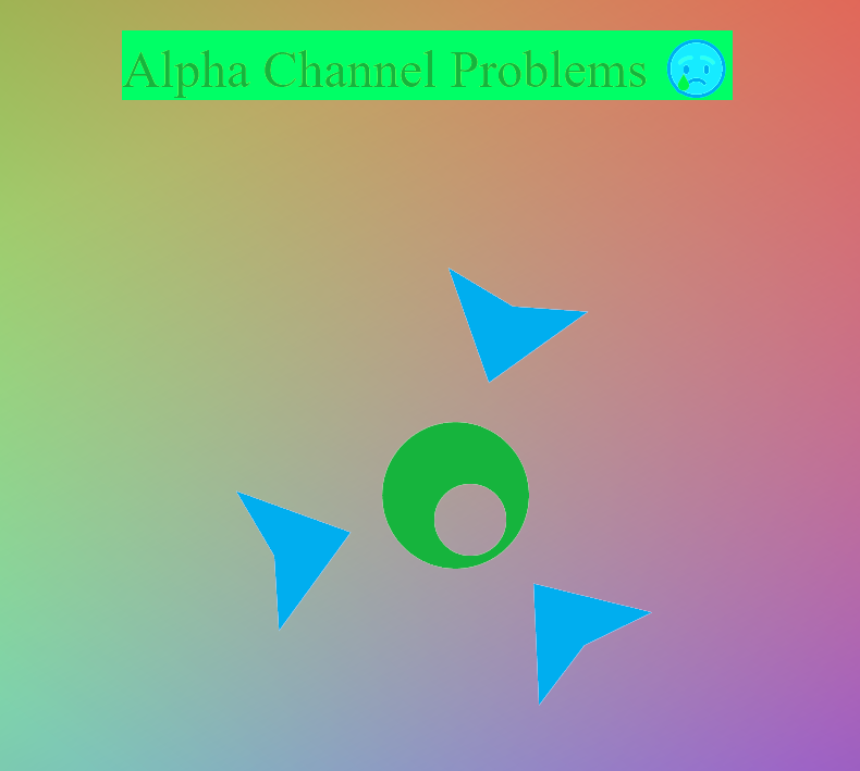
The alpha channel problem

While feBlend seem to accomplish what’s needed, for anything other than a white background you’ll notice a white-ist outline around elements in the image, as you can see below.

alpha channel problems with feBlend

The problem is that for what we’re trying to accomplish we just want to simply preserve the alpha channel, not blend it in any way. However, all feBlend operations will perform a blend of the alpha channel. From the SVG spec:

image multiply

So there’s no way we can really work with feBlend to get a solution for the alpha channel, but we do have an idea of what the solution is: copy the alpha channel from the source image.

Fixing the alpha channel

Fixing the alpha channel will involve 2 steps:

  • For the image outputted by feBlend, get the alpha value to be 1 for every pixel
    (the reason this step will become apparent once we look at how feComposite has to be used)
  • Use feComposite to construct an image with the alpha values from the source image and the R,G,B values from the image outputted by feBlend

The first step is simple. We just need a slight modification to the 2 color transformation matrices used, such that one or both set the alpha channel to 1 for every pixel (note from the alpha blending equation, this will effectively set the alpha value to 1 for every pixel in the output). The modified matrices are shown below and it’s a good point to start showing some code.

The full-alpha add colorK matrix:

[[1, 0, 0, 0, R_(k)], [0, 1, 0, 0, G_(k)], [0, 0, 1, 0, B_(k)], [0, 0, 0, 0, 1]][(R_(src)), (G_(src)), (B_(src)), (A_(src))] = [(R_(src) + R_(k)), (G_(src) + G_(k)), (B_(src) + B_(k)), (1) ]

<feColorMatrix in="SourceGraphic" type="matrix" result="imageA"
    values="1 0 0 0 0
            0 1 0 0 0.68235294117
            0 0 1 0 0.93725490196
            0 0 0 0 1" /> 

The full-alpha invert & add colorK matrix:

[[-1, 0, 0, 0, 1 + R_(k)], [0, -1, 0, 0, 1 + G_(k)], [0, 0, -1, 0, 1 + B_(k)], [0, 0, 0, 0, 1]][(R_(src)), (G_(src)), (B_(src)), (A_(src))] = [(-R_(src) + 1 + R_(k)), (-G_(src) + 1 + G_(k)), (-B_(src) + 1 + B_(k)), (1)]

<feColorMatrix in="SourceGraphic" type="matrix" result="imageA"
    values="-1 0 0 0 1.0784313725
            0 -1 0 0 1.7058823529
            0 0 -1 0 1.2431372549
            0 0 0 0 1" />

For the next and final step, we need to take a look at feComposite.

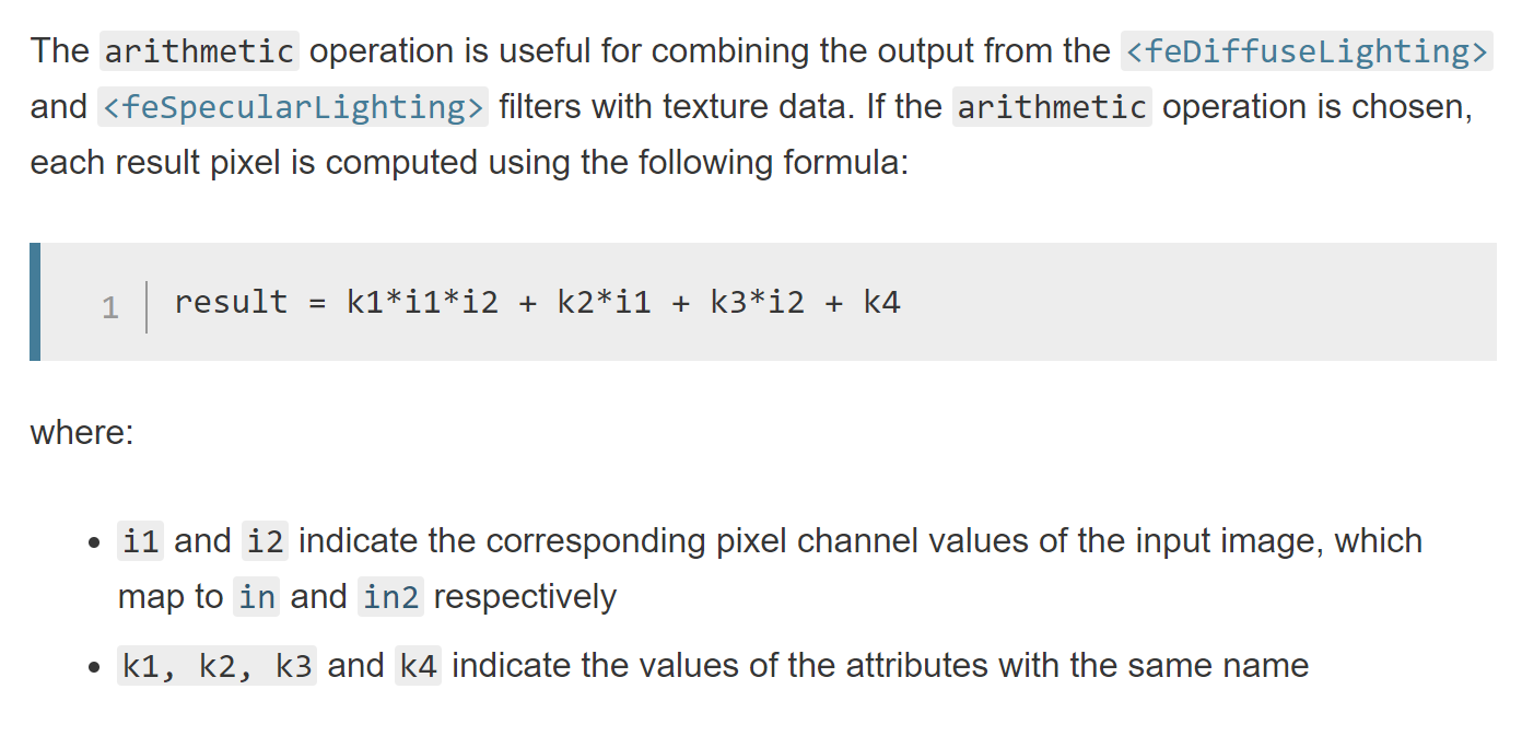
The feComposite filter primitive allows for more fine-grained operations on pixels using the supported “arithmetic” operation:

feComposite arithmetic operation

As this operation is done on every channel, including the alpha channel, we have way to control what happens to the alpha pixels in a composition of 2 images.

We’re going to make use of this by:

  • Using an feColorMatrix, where the input in the source image, and transforming such that R,G,B is white [1,1,1] and the alpha remains unchanged
  • Using feComposite to do a simple arithmetic multiply (k1=1, k2=0, k3=0, k4=0), between the image constructed above (where R,G,B is [1,1,1] and alpha is the alpha from the source image) and the output from feBlend (where the R,G,B = the values we want for the output and alpha = 1)

Effectively, the source alpha is multiplied by 1 (as the image produced from the feBlend operation has the alpha set to 1 for all pixels) and the R,G,B values from the feBlend output are multiplied by 1 (as the constructed image, in the first step above, sets R,G,B to 1 for every pixel).

<!-- Get and use alpha from source image -->
<feColorMatrix in="SourceGraphic" type="matrix" result="whiteAlpha"
    values="0 0 0 0 1
            0 0 0 0 1
            0 0 0 0 1
            0 0 0 1 0" />     

<feComposite in="whiteAlpha" in2="outputFullAlpha" operator="arithmetic" k1="1" k2="0" k3="0" k4="0" />

Pulling everything together

We now have all the pieces for the filter and here’s what the code looks like:

<svg style="width:0; height:0; margin:0; padding:0; border:none;">
    <filter color-interpolation-filters="sRGB" id="colorTransformFilter">

        <feColorMatrix in="SourceGraphic" type="matrix" result="imageA"
            values="1 0 0 0 0
                    0 1 0 0 0.68235294117
                    0 0 1 0 0.93725490196
                    0 0 0 0 1" /> 

        <feColorMatrix in="SourceGraphic" type="matrix" result="imageB"
            values="-1 0 0 0 1.0784313725
                    0 -1 0 0 1.7058823529
                    0 0 -1 0 1.2431372549
                    0 0 0 0 1" />              
                    
        <feBlend 
            color-interpolation-filters="linearRGB"
            in="imageA" 
            in2="imageB" 
            mode="multiply" 
            result="outputFullAlpha" />        

        <!-- Get and use alpha from source image -->
        <feColorMatrix in="SourceGraphic" type="matrix" result="whiteAlpha"
            values="0 0 0 0 1
                    0 0 0 0 1
                    0 0 0 0 1
                    0 0 0 1 0" />     

        <feComposite in="whiteAlpha" in2="outputFullAlpha" operator="arithmetic" k1="1" k2="0" k3="0" k4="0" />

    </filter>
</svg>

The demo below uses the filter, along with a bit of Javascript to cycle and update the input colors (i.e. dynamically updating the values plugged into the first 2 feColorMatrix elements):

Limitations

We have the same limitations I mentioned in part 1:

  • For icons applied as background-images, the CSS filter property isn’t ideal. CSS filter will effect not only the element it’s applied to, but all child elements as well
  • As is the case with mixing the CSS filter property and the SVG filter element, effects governed by the CSS transition property won’t work

In addition, because of how the alpha channel in treated in regards to feBlend (setting all pixels to have alpha=1), you more than likely won’t get good results if the icon has different-colored adjoining or overlapping elements, as you won’t get a smooth transition at the edges/boundaries.
Using feColorMatrix to dynamically recolor icons (part 1, single-color icons)

I’ve been experimenting with using feColorMatrix as an elegant way to dynamically color/re-color SVG icons. Here I’ll look at working with single-color icons.

Working directly with the SVG markup

Changing the stroke and/or fill colors of the SVG elements directly can be a good solution in many cases, but it requires:

  • Placing the SVG markup into the document to query and modify the appropriate elements when a color update is needed (note that this option isn’t viable if you need to place the icon in an <img> tag or it needs to be placed as a background-image on an element, as you can’t reference the SVG element in such cases)
  • Treating the SVG markup as a templated, Javascript, string to make a data-URI, and re-making it when a color update is needed

By using the color transformation matrix provided by feColorMatrix these restrictions go away and we also get back the flexibility of using external files.

Icon color

Keep in mind, we’re only dealing with single-color icons. What color is used doesn’t technically matter, but black is a nice basis and in an actual project, black is beneficial, as you’re able to open your the icon files in an editor or browser and actually see it.

black colored icon

A black pixel within the icon can then be represented by the following vector:

black pixel as column vector

Note that the alpha component may vary due to antialiasing (to smooth out edges) or some translucency within the icon.

The color transformation matrix

feColorMatrix allows you to define a 5×4 transformation matrix. There’s a lot you can do with that, but note that the last column of the matrix is essentially an additive component for each channel (see matrix-vector multiplication), so in that column we enter the desired R, G, B values from top to bottom, which will be added to the zeros in the input vector. Next, we want to preserve the alpha component from the input vector, so the fourth column of the matrix becomes [0, 0, 0, 1]T and the fourth row of the last column is zero, as we don’t want to add anything to the alpha component.

color transformation matrix, [[0, 0, 0, 0, R], [0, 0, 0, 0, G], [0, 0, 0, 0, B], [0, 0, 0, 1, 0]][(0), (0), (0), (A_(src))] = [(R), (G), (B), (A_(src))]

The matrix-vector multiplication gives a new vector (that defines the output pixel) with the entered R, G, B values and the alpha value from the source pixel.

Representing the matrix within an feColorMatrix element is straightforward…

<feColorMatrix in="SourceGraphic" type="matrix"
values="0 0 0 0 R
0 0 0 0 G
0 0 0 0 B
0 0 0 1 0"
/>

… just plug in values for R, G, B.

Applying the color transformation

The color transformation matrix can be applied to an element by wrapping it in an SVG filter element and referencing the filter via the CSS filter property.

With Javascript, the values attribute of the feColorMatrix element can be updated dynamically. The color change will, in turn, be reflected in any elements referencing the SVG filter.

<!DOCTYPE html>
<html>
<body>
<!--
The values of the color matrix defines the color transformation what will be applied.
Here we just setup the elements and define an identity matrix. We'll modify the matrix via Javascript code
to define an actual color transformation.
-->
<svg style="width:0; height:0; margin:0; padding:0; border:none;">
<filter
color-interpolation-filters="sRGB" id="colorTransformFilter">
<feColorMatrix
in="SourceGraphic" type="matrix"
values="1 0 0 0 0
0 1 0 0 0
0 0 1 0 0
0 0 0 1 0"
/>

</filter>
</svg>

<!--
Element with an SVG icon that we want to colorize
Note: that the color transformation is applied to everything not only to the background, but everything
within the element as well.

Typical solution to to isolate background stuff to it's own div and use another div for contents

-->
<div id="logo-colored"
style="
width:300px;
height:300px;
background-color: transparent;
background-image: url(logo.svg);
background-position: center center;
background-repeat: no-repeat;
background-size: cover;
filter:url(#colorTransformFilter);"
>

<p
style="color:#fff">Testing 1 2 3...</p>
</div>

<script
type="text/javascript">
/**
* A little helper function to update the color transformation matrix
*
* @param {Number} _r
* @param {Number} _g
* @param {Number} _b
*/
const setPrimaryColor = function(_r, _g, _b) {

const rScaled = _r / 255.0;
const gScaled = _g / 255.0;
const bScaled = _b / 255.0;

const feColorMatrixElem = document.getElementById('colorTransformFilter').getElementsByTagName('feColorMatrix')[0];
feColorMatrixElem.setAttribute(
`values`,
`0 0 0 0 ${rScaled}
0 0 0 0 ${gScaled}
0 0 0 0 ${bScaled}
0 0 0 1 0`
);
};

// Set/update color transformation matrix
setPrimaryColor(129, 0, 0);
</script>

</body>
</html>

The code will take a black-colored icon and re-color it to [129, 0, 0], as seen below:

Limitations

This technique provides a lot of flexibility, but it’s not without it’s limits.

  • For icons applied as background-images, the CSS filter property isn’t ideal. CSS filter will effect not only the element it’s applied to, but all child elements as well. Note the “Testing 1 2 3…” paragraph is re-colored in the demo above.
  • As is the case with mixing the CSS filter property and the SVG filter element, effects governed by the CSS transition property won’t work.

Similar techniques

  • For shifting between colors, the hue-rotate() CSS filter function can be a solution. However, in practice, I don’t find this intuitive and color changes are rarely just hue rotations.
  • A more limited case, transitioning a colored icon to white, can be achieved with 2 CSS filter functions, brightness(0) and invert(100%).
  • You can do crazier things by trying to compute and fit a solution to the hue-rotation, saturation, sepia, and invert filter functions; however this is both complex to grasp and produces inexact/approximate color matches.
  • An SVG filter using feComponentTransfer should work, but I don’t find it as intuitive to work with.

Resources

If you want to interactively play around with feColorMatrix, check out SVG Color Filter Playground.

Brute-force convex hull construction

I’ve been experimenting a bit with convex hull constructions and below I’ll explain how to do a brute-force construction of a hull.

It’s worth noting up-front that the brute-force method is slow, O(n3) worst case complexity. So why bother? I think there are a few compelling reasons:

  • The brute-force method expresses the fundamental solution, which gives you the basic building blocks and understanding to approach more complex solutions
  • It’s faster to implement
  • It’s still a viable solution when n is small, and n is usually small.

What is a convex hull?

You can find a formal definition on Wikipedia. Informally, and specific to computational geometry, the convex hull is a convex polygon in which all points are either vertices of said polygon or enclosed within the polygon.

Brute-force construction

  • Iterate over every pair of points (p,q)
  • If all the other points are to the right (or left, depending on implementation) of the line formed by (p,q), the segment (p,q) is part of our result set (i.e. it’s part of the convex hull)

Here’s the top-level code that handles the iteration and construction of resulting line segments:

/**
* Compute convex hull
*/
var computeConvexHull = function() {
console.log(
"--- ");

for(var i=0; i<points.length; i++) {
for(var j=0; j<points.length; j++) {
if(i === j) {
continue;
}

var ptI = points[i];
var ptJ = points[j];

// Do all other points lie within the half-plane to the right
var allPointsOnTheRight = true;
for(var k=0; k<points.length; k++) {
if(k === i || k === j) {
continue;
}

var d = whichSideOfLine(ptI, ptJ, points[k]);
if(d < 0) {
allPointsOnTheRight =
false;
break;
}
}

if(allPointsOnTheRight) {
console.log(
"segment " + i + " to " + j);
var pointAScreen = cartToScreen(ptI, getDocumentWidth(), getDocumentHeight());
var pointBScreen = cartToScreen(ptJ, getDocumentWidth(), getDocumentHeight());
drawLineSegment(pointAScreen, pointBScreen);
}

}
}
};

The “secret sauce” is the whichSideOfLine() method:

/**
* Determine which side of a line a given point is on
*/
var whichSideOfLine = function(lineEndptA, lineEndptB, ptSubject) {
return (ptSubject.x - lineEndptA.x) * (lineEndptB.y - lineEndptA.y) - (ptSubject.y - lineEndptA.y) * (lineEndptB.x - lineEndptA.x);
};

This is a bit of linear algebra derived from the general equation for a line.

The result represents the side of a line a point is one, based on the sign of the result. We can check if the point is on the left or on the right, it doesn’t matter as long as there is consistency and the same check is done for all points.

How it looks

I made a few diagrams to show the first few steps in the algorithm, as segments constituting the convex hull are found. The shaded area represents our success case, where all other points are to the right of the line formed by the points under consideration. Not shown are the failure cases (i.e. one or more points are on the left of the line formed by the points under consideration).

convex hull construction, brute force, step 1

convex hull construction, brute force, step 1

convex hull construction, brute force, step 1

Code and Demo

You can play around with constructing a hull below by double-clicking to add vertices.

You can find the code on GitHub.

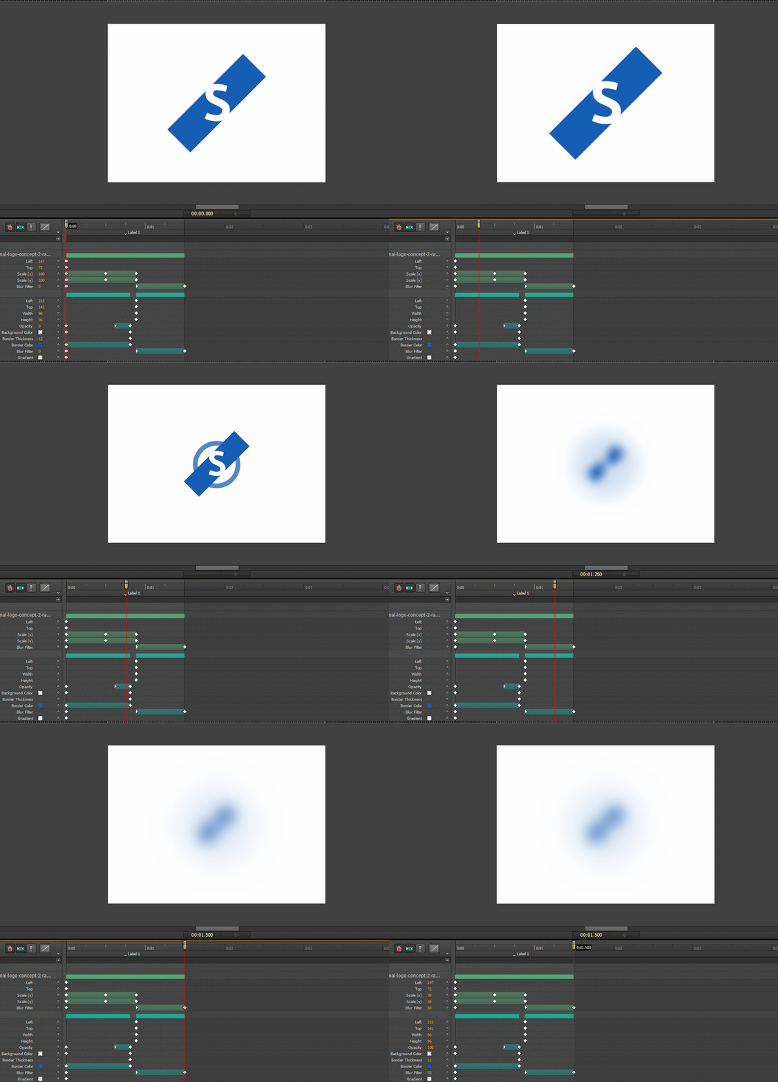
A look at Adobe Edge Animate

I recently played around a bit with Adobe Edge Animate, as I was searching for an SVG animation tool, and jotted down a few notes on my impression of the editor.

Adobe Edge Animate CC 2014
  • The timeline and visual preview are excellent, it’s refreshing to have something like this available for web animations. I did notice a tendency for the preview to tear and flicker when animating but, overall, it’s a minor annoyance.
  • The output is not cross-platform, the generated code is heavily webkit-based and depends on vendor-prefixed styles (-webkit-filter) for certain effects. It’s cool to see the effect and have them in the editor, but it really doesn’t achieve a “write once, run anywhere” development process.
  • This is not an SVG animation tool. I expected transitions and transformation on SVG elements (groups, paths, etc.), instead what’s generated is CSS3 transitions/transformations on a <div> element (the SVG document is simply put as the background-image of the <div>). This severely limits what can be done. Much richer and expressive animations could be achieved by allowing manipulating the points and control points on individual SVG elements.

It’s disappointing that despite being an incredibly visual medium, most web design tasks are still done by writing linear blocks of code. Animation is a task well suited for a WYSIWYG editor and Edge Animate is ultimately a step in the right direction, but it’s basis on CSS3 transition and transform puts some hard limits on what can be achieved and I can’t see myself using it for anything substantial.

Rtf2Html 1.3

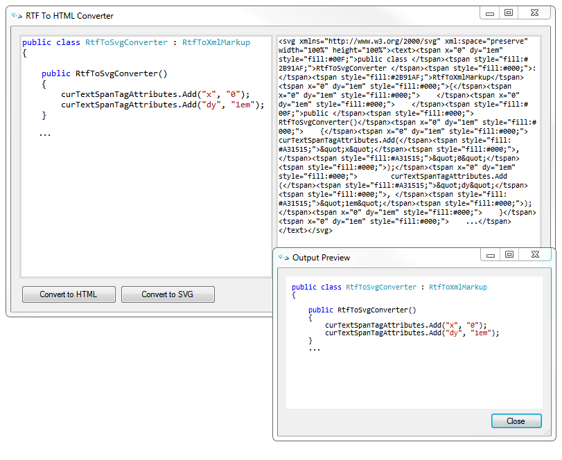
I recently made a small update to Rtf2Html (the converter I wrote for converting RTF text to HTML markup):

  • Support for conversion to SVG markup
  • Updated preview form to use GeckoFX 29 and XULRunner 29.0.1 (the major version numbers have to match)

Download it here.
Note that this version requires the .NET Framework v4.0 or later.

Rtf2Html SVG support

While you can put the generated SVG text on a page, that wasn’t really my motivation here; what I wanted was a way to import syntax-highlighted text (in my case, typically code) into a vector graphics application (Inkscape, Illustrator, etc.) to be placed as part of a diagram.

Entering the world of high-DPI displays

With a Retina iPad and my recent purchase of a Yoga 2 laptop with a “Quad HD” display (3200×1800) I’ve been dragged into the world of high-DPI (more precisely PPI) displays. For years, DPI was “standard” at either 96dpi (Windows) or 72dpi (Mac OS), with a logical/software pixel being equivalent to a hardware pixel on the display device. A higher resolution monitor meant the content on your display got a bit smaller but you gained a couple more thousand pixels to work with, but the recent and massive increases in pixel densities seems to be the end of the 1:1 mapping between software and hardware pixel references. Below are a few notes on my experiences dealing with high-DPI displays and content so far.

  • Windows 8.1 support is terrible. Both application support and operating system support for high-DPI displays is abysmal. See the post Living a High-DPI desktop lifestyle can be painful by Scott Hanselman which reflects many of the issues I’ve encountered with my Yoga 2 as well. There’s a large list of issues: for non-DPI aware applications Windows scale text but not icons and layout, applications lie about being DPI-aware and are rendered too small, and some applications simply crash (TourtiseSVN’s diff… no clue why, too many pixels?!). It’s easy to wag a finger at application developers, but legacy support is clearly something the operating system needs to handle. In addition, despite Windows 8.1 touting automatic, per-monitor, DPI detection, it’s all based off of the DPI of a “primary monitor” and content on the other monitors is scaled to match. So dragging a window for an application from the Yoga 2 display across to a HD/96dpi monitor results in the window being scaled down (and visibly blurry). Worse, all applications undergo the same treatment – so if you’re thinking you can just use non-DPI aware applications on an external display until support comes around, guess again.
    ArsTechnica did a piece mentioning this issue in particular, and Windows 8.1’s high-DPI support is general.
  • Web support is only half-way there. The best thing done to support high-DPI displays was defining the CSS2 reference pixel to be independent of hardware pixels. Beyond that you have media queries and higher resolution background images, but there’s still no good way to specify alternate foreground images, though the <picture> element may gain support soon. In general, outside of CSS things gets messy, as is the case with a high-DPI <canvas>.
    One problem with the web that I don’t see a proposed solution for is handling low-resolution image assets for which you can’t get a higher resolution version. This is a problem I face with this blog. There’s a lot of images (old screenshots, low-resolution photos, etc.) for which I can’t get a 2x, 4x, etc., higher resolution version and there’s no way to prevent upscaling the images or specify how the upscaling is done. The typical 2x-bilinear-filtered upscaling, done by most browsers, is not always desirable. In addition, as display vendors pack more pixels in, what happens when the “high-resolution” version needed is 4x or 8x?
  • SVG/Vector-based images aren’t always the answer. There’s a lot of benefits to vector-based formats, but they’re not the holy grail many think they are. For vector-based images, rendering costs grow as you add details with polygons and paths. It’s why video games still rely heavily on texture mapping, even as graphics hardware has progressed to handle rendering millions of polygons per frame – the additional geometry and computation for fine details is enormous.

No SMIL+SVG in Internet Explorer

After noticing the SMIL animation in my previous post on SVG animations not working in Internet Explorer 10, I did a bit of digging to see what level of support was offered by IE10 and IE9 (previous versions do not support SVG). Simply put, Internet Explorer does not support SMIL animation of SVG. An entry from IEBlog regarding the an IE9 platform preview explains why:

… support for SMIL animation of SVG in the web development community is far from strong. The leader of the SVG standardization effort wrote that not supporting SMIL in its current state is probably best “since the SVG WG intends to coordinate with the CSS WG to make some changes to animation and to extend filters.” There’s already work started to reconcile CSS3 animations and SVG.

I’m not shedding any tears. That said, I’m not that enthusiastic about CSS3 animations for SVG either, as CSS3 animations bring with them the same loss of flexibility as SMIL. The current, flexible, cross-browser solution for SVG animation is Javascript, and I can’t see why that’s not a worthwhile solution for the foreseeable future as well.

SVG Animations

I decided to play around a bit with animating SVG content. There are actually multiple ways to animate SVG: CSS (transition, transform, @keyframes), Javascript, or Synchronized Multimedia Integration Language (SMIL). Where possible, I tend to prefer Javascript, as you have far more flexibility compared to markup languages; however, out of curiosity, I did try my hand at SMIL as well.

Method 1: Javascript

Here’s the SVG markup for the object being animated.

<svg version="1.1" x="0px" y="0px" width="74px" height="74px" viewBox="-1.751 -1.751 74 74" enable-background="new -1.751 -1.751 74 74" xml:space="preserve">
    <
g id="circularMarker" transform="rotate(0 35.163 35.521)">                
        <
path fill="#27AAE1" d="M46.336,7.908c2.174,0.678,4.236,1.538,6.199,2.54V3.69c-1.417-0.607-2.875-1.146-4.377-1.616
            C37.794-1.161,27.147-0.491,17.793,3.242v6.663C26.41,5.825,36.518,4.843,46.336,7.908z"/>
        <
path fill="#27AAE1" d="M62.423,46.338c-0.679,2.173-1.537,4.236-2.538,6.199h6.757c0.605-1.417,1.147-2.877,1.615-4.382
            c3.235-10.364,2.564-21.006-1.167-30.362h-6.664C64.505,26.41,65.489,36.52,62.423,46.338z"/>
        <
path fill="#27AAE1" d="M23.992,62.42c-2.171-0.678-4.236-1.536-6.199-2.538v6.759c1.418,0.604,2.877,1.146,4.381,1.616
            c10.364,3.233,21.009,2.564,30.362-1.17v-6.664C43.921,64.505,33.81,65.488,23.992,62.42z"/>
        <
path fill="#27AAE1" d="M7.909,23.994c0.678-2.174,1.538-4.237,2.538-6.2H3.691c-0.606,1.416-1.147,2.878-1.617,4.38
            c-3.234,10.364-2.564,21.012,1.168,30.365h6.664C5.825,43.921,4.843,33.813,7.909,23.994z"/>
        <
circle fill="#00AEEF" cx="35.163" cy="35.521" r="11.331"/>
    </
g>
</
svg>    

To animate, the transform attribute on the #circularMarker group element is updated every frame to do a simple rotation at a rate of 0.275 deg/ms. You can see the result in the iframe below.

Here’s the Javascript code that makes it happen:

<script src="jquery-1.8.2.min.js" type="text/javascript"></script>
<
script type="text/javascript">

// setup window.requestAnimationFrame
(function ()
{
var requestAnimationFrame = window.requestAnimationFrame || window.mozRequestAnimationFrame ||
                                 window.webkitRequestAnimationFrame || window.msRequestAnimationFrame;
window.requestAnimationFrame = requestAnimationFrame;
})();


// set initial frame time (in milliseconds)
var ft1 = new Date().getTime();

// set initial angle (in degrees)
var angleDeg = 0;

// function to rotate circle
function rotateCircularMarker()
{
var ft = new Date().getTime();
var ftDelta = ft - ft1;
ft1 = ft;

// rotate at a rate of 0.275 deg/ms
angleDeg += ftDelta * 0.275;

if (angleDeg >= 360) {
// full circle!, reset angleDeg
angleDeg = 0;
}

// transform the #circularMarker group
// Note: the rotation is about the center of the circle element (35.163, 35.521)
$('#circularMarker').attr('transform', 'rotate(' + angleDeg + ' 35.163 35.521)');

// call requestAnimationFrame to continue animating
requestAnimationFrame(rotateCircularMarker);
}

$(document).ready(
function ()
{

rotateCircularMarker();

});
            
</script>

Note that window.requestAnimationFrame is used, so a modern browser is required. For older browsers it is possible to use window.setInterval as a fallback.

Method 2: SMIL

With SMIL, the SVG code remains the same, with the exception of an animateTransform tag within the #circularMarker group element.

<animateTransform attributeName="transform" attributeType="XML" type="rotate" from="0 35.163 35.521" to="360 35.163 35.521" begin="0s" dur="1.336996s" repeatCount="indefinite"/>

The attributes of animateTransform describe the animation, mainly type, from, to, begin, dur, and repeatCount.

Obviously SMIL yields less code and removes all Javascript dependencies, but it does come at the cost of losing flexibility (as you can only perform transformations and timing operations supported by SMIL attributes) and having to learn yet another markup language.